Capture the Status Quo
Before I tell you more, quickly grab a piece of paper and a pen of your choice and write a sentence. The content doesn’t matter. What we want is a “before” writing sample. This will allow you to see where you currently stand and check how your writing changes when you implement the upcoming tips. If you’re looking for a text: you can take the first line of your favorite song or (if you’re lacking inspiration) one of these example sentences:
- Those who write, stay.
- Today is a good day for a first step.
- Writing is like talking, only there’s more time to think.
Done? Very good. Then lean back for a moment, gather some ideas from me, and try again right after. I guarantee you: you will be amazed at how quickly you make progress.
The Setup
Before we dive into the letters themselves, here are a few general tips that will make your work easier and help you achieve a nicer appearance in record time:
Use Round Tips
For writing on the flipchart, practically all books and 99% of trainers recommend pens with chisel tips. Why? It remains a mystery to me. Because chisel tips make writing (especially for beginners) very cumbersome, wasting unnecessary time and nerves. This is neither fun nor does it create a good impression. Why struggle? In the future, instead of reaching for a chisel tip, grab a round tip and you will see how much easier it will be for you to draw even lines.
My personal favorite for the flipchart is the neuland No. One Outliner with round tip for writing and the neuland FineOne with round tip for details and drawing. Unfortunately, I don’t get any discounts for the recommendation, but if anyone from Neuland is reading: feel free to reach out :)
Write in Black
And while we’re at it: sort out your colorful pens. Or at least keep them out of reach when you are writing. Always use a black pen for writing. Yes, ALWAYS. This saves you time (you don’t have to think about which pen to grab) and your texts will have the maximum contrast to the paper, making them particularly easy to read.
Use a Guideline
I hardly know anyone who can draw perfect straight lines on a white sheet of paper. But you don’t have to. Just use a guideline, like we did in school (at least in my time). Some flipchart pads already come with a checked or lined pattern. This is super helpful, but it doesn’t look particularly nice in the photo documentation afterward. Therefore, turn the sheet over before you start writing. This way, when you are writing close to the paper, you can still see the guide lines. At the same time, when you photograph the flipchart at the end, you will have a uniformly white background without distracting lines or logos from paper manufacturers.
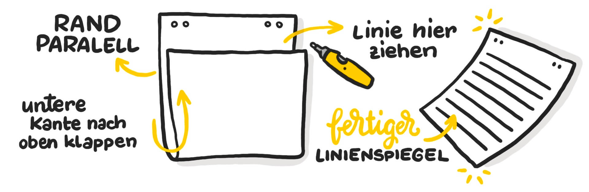
Is your flipchart paper not lined or checked? No problem. You can quickly create your own guideline: Take a blank sheet and fold the bottom edge up; now you can use the paper edge to draw a straight line.
Slide the sheet down one line at a time to finalize the guideline. You can now place the finished guideline under the sheet you want to write on. Et voilà. Straight lines suddenly become very easy.
Pay Attention to Space Allocation
Many tend to write small and in the top left corner. This saves space, but usually doesn’t look very nice on the finished flipchart. Therefore, think about how much text should go on the sheet before you start writing and position your words accordingly.
You can also create structure with a heading. Make sure to design this slightly larger than the body text or the list below.
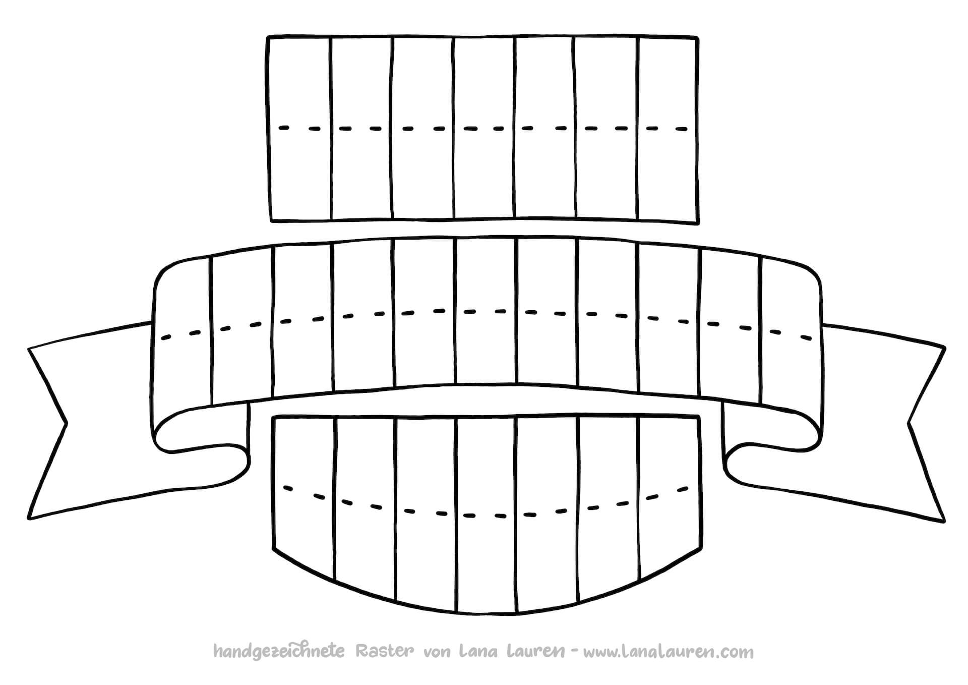
Use Grids
Fonts look particularly nice when they are not only placed sensibly but also highlighted with banners and boxes. Since this is difficult to achieve spontaneously, it’s best to use pre-made grids for this purpose. In my next email newsletter, you will receive a link where you can download these for free. If you haven’t signed up yet: this way.
The Letters
So, now we get to the nitty-gritty. Take a closer look at your text from earlier. What do you notice? Which parts are easier to read and which are more difficult? What looks neat and where do the letters give a less tidy impression? In the seminars I conduct, I often observe the following:
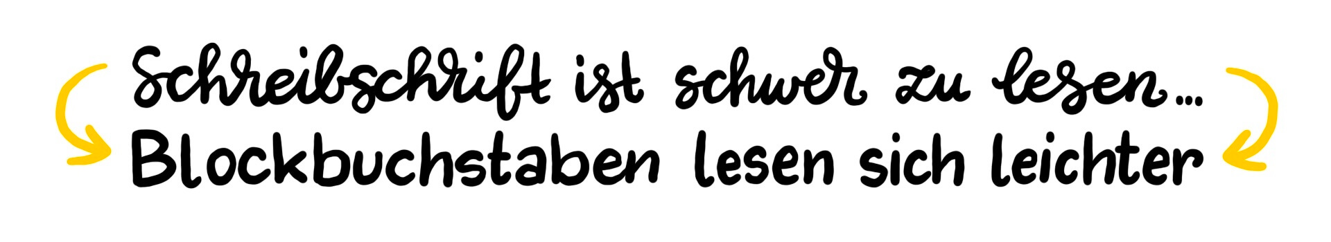
Prefer Block Letters
Cursive can be a very nice element for designing flipcharts. However, texts are often easier to read when written in block letters.
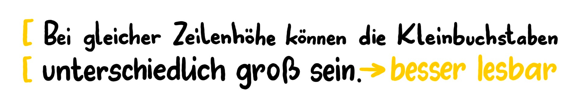
Enlarge Lowercase Letters
The larger the letters, the easier they are to read. This does not necessarily mean that the line height needs to increase. If your lowercase letters are only half the size of your uppercase letters, try rewriting your text and giving the lowercase letters more space. They can be 2/3 or 3/4 the size of the uppercase letters.
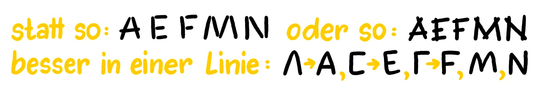
Extend Lines
Many tend to lift their pen unnecessarily often. Try to extend lines where possible, writing without lifting the pen. Letters where this is particularly noticeable are the uppercase letters A, E, F, M, N, V, and W.
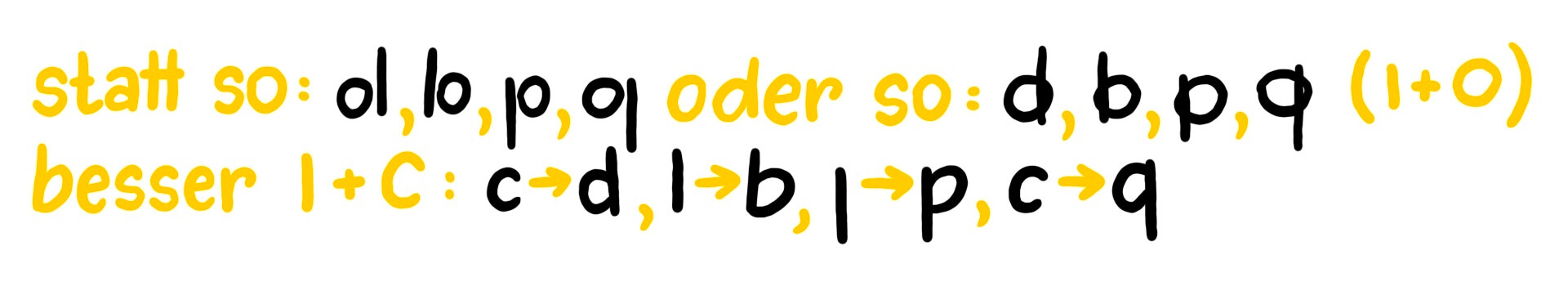
I + C instead of I + O
For lowercase letters, there are some where a circle meets a line: d, b, p, q. Try to compose the letters from an I and a C instead of an I and an O. This avoids overlap and makes the letters look much tidier.
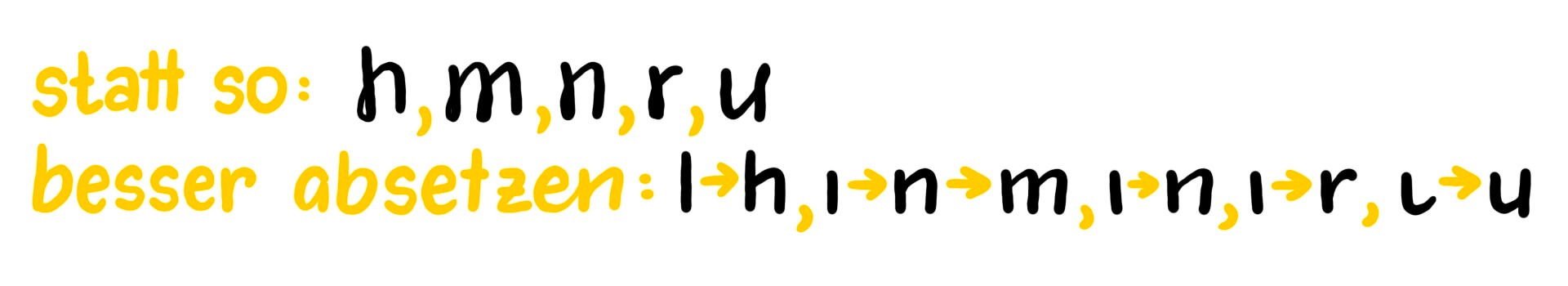
Avoid Doubling
Another group of letters where there is often room for improvement is the lowercase letters h, m, n, r, and u. Here, parts of the letters are often drawn twice. If you consciously lift your pen instead, you can create a much clearer appearance of the writing.
The Implementation
Now it’s time to get to work. Write the text you initially wrote a second time, keeping in mind the tips I provided. It looks quite different, doesn’t it?
Feel free to share your writing experiments with me and reach out if you have any questions or requests for further input on the topic of writing.